In this tutorial, you will learn how to create a statistical process control chart in Excel.
Process performance can be tracked using basic graphical tools called Statistical Process Control (SPC) charts. They are used to determine the kind of process variation that exists. They point out areas that might need more research.
Once you are ready, we can get started by using real-life scenarios to help you understand how to create a statistical process control chart in Excel.
Table of Contents
Create a Statistical Process Control Chart
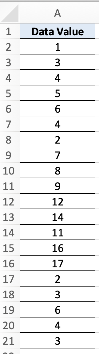
Before we begin we will need a group of data to be used to create a statistical process control chart in Excel.
Step 1
Make sure your group of data is displayed in a clean and tidy manner in the first sheet.
Step 2
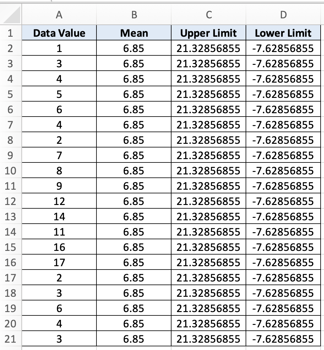
To create a statistical process control chart we will need to find the mean, upper limit and lower limit. To find the mean, we will use this formula =AVERAGE($A$2:$A$21). To find upper limit we will use this formula =$B$2+3*STDEV.S($A$2:$A$21). To find the lower limit we will use this formula =$B$2-3*STDEV.S($A$2:$A$21).
Step 3
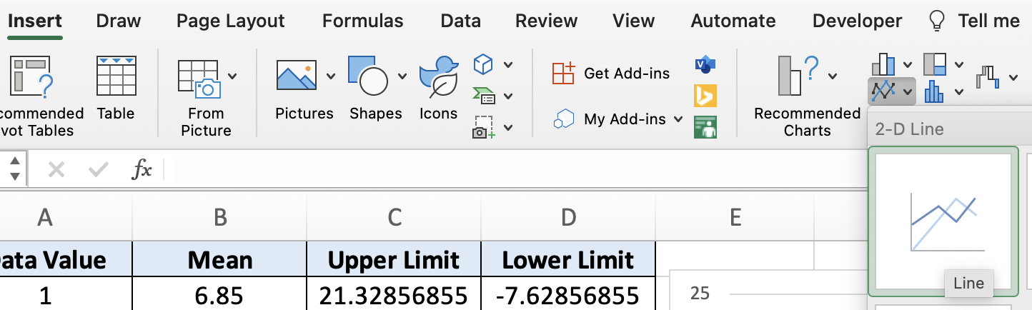
To insert the statistical process control chart, we will need to select the entire data group, select ‘Insert’ then select ‘Line chart’.
Step 4
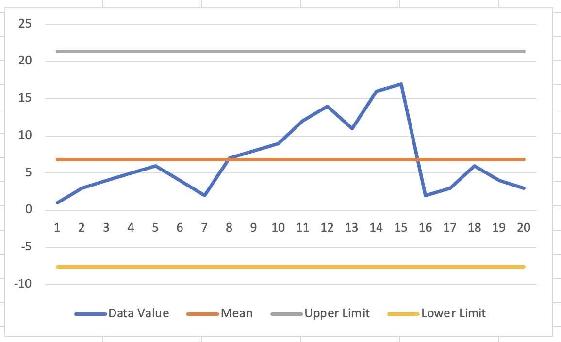
Once you are done, your chart will look like this